
Iconic logos get a makeover
Ever wondered what your favorite brands would look like if they were designed centuries ago—or maybe if they popped out of an 80s arcade? Get ready to see iconic logos as they’re reimagined in different time periods.
Medieval style: knights, castles and mythical beasts
First stop: the Middle Ages! Picture Apple, WhatsApp, and Google logos as if they belong in an ancient manuscript. Designer Ilya Stallone is the mastermind behind these medieval reboots, turning iconic brands into illustrations with a whimsical twist.
Apple: The Apple logo in medieval style is transformed into a large, red apple with a single bite taken out. For a whimsical twist, a friendly little worm peeks out, adding a playful, hand-drawn charm.
WhatsApp: WhatsApp’s medieval makeover turns the familiar phone icon into a traditional horned communication device. A white horn winds into a loop within the classic green chat bubble, giving it a medieval messaging vibe.
Google: A mythical “G” formed by a golden lion, green alligator, and blue fish-like creature, with a medieval figure studying a scroll at the top. The design captures Google as an ancient knowledge guild.

1980s style: Going retro!
Now let’s dive into the 1980s, where everything was bright, bold, and neon. Picture brands like Spotify and Duolingo having that “nostalgic vibe”. Instagram user @kxdgraphcs perfectly captures the era of arcades and synth music in these retro remakes.
Gmail: Gmail gets an 80s twist with a rainbow-striped mailbox and a chunky, colorful font. Total retro mail vibes!
YouTube: YouTube’s now an old-school TV with rabbit ears and a warm, vintage screen. It’s like tuning into a classic channel.
Duolingo: Duolingo’s owl looks like a retro video game character, rocking bright greens and bold yellow text. Super fun and nostalgic!

Modern style: Minimal, clean and stylish
Fast-forward to today’s minimalism, where logos are all about clean lines and sleek simplicity. These modern versions designed by various designers strip down each brand to its core essence, giving them a chic, contemporary style.
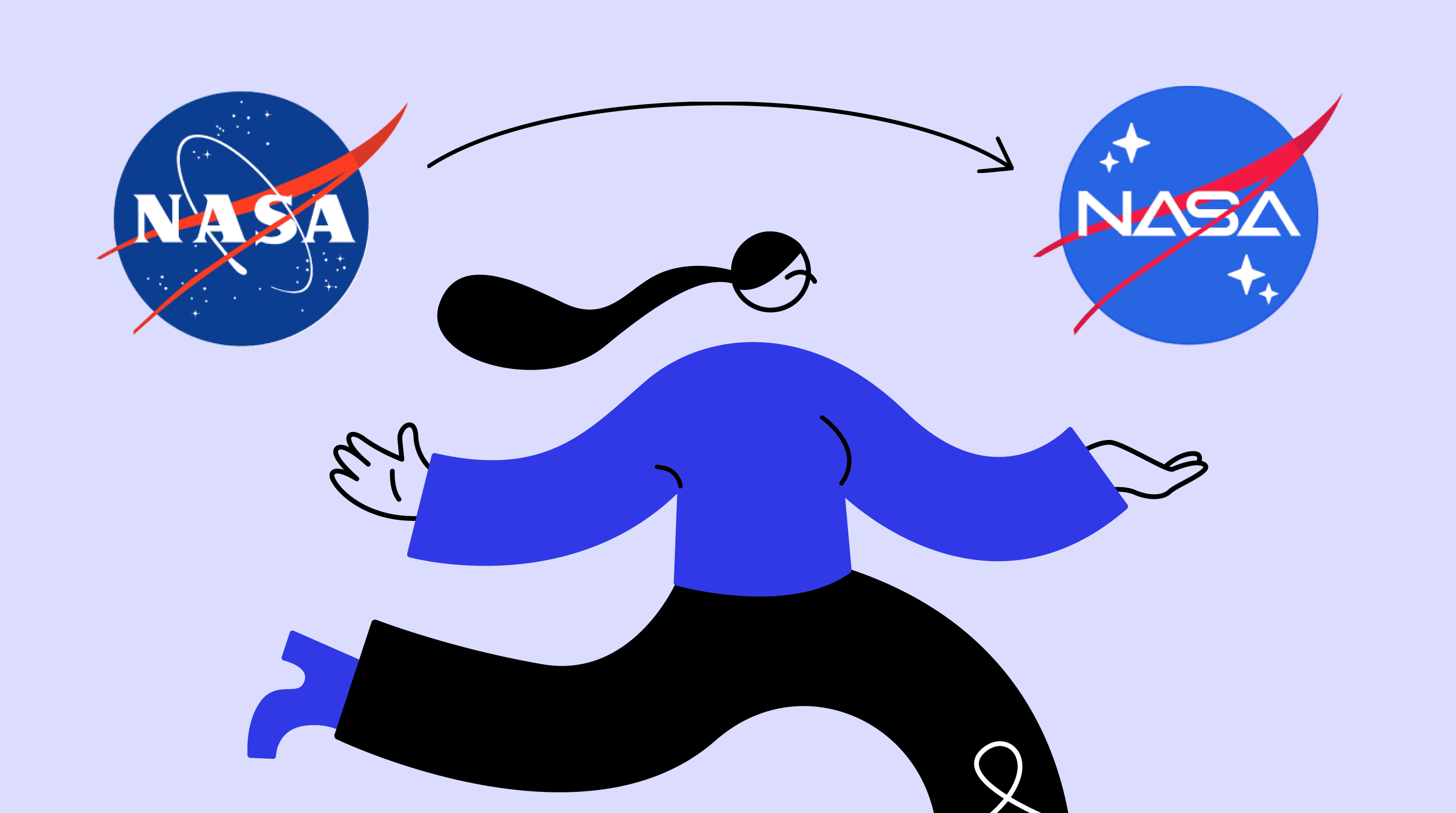
NASA: NASA’s logo gets a sleeker, simplified look with sharper stars and a cleaner font, keeping that iconic red swoosh but with a more minimalist vibe.
Ford: Ford’s new look trades the vintage oval for a sleek, modern typeface with clean lines, making it feel fresh and futuristic.
LEGO: LEGO’s updated logo goes ultra-minimal with blocky, pixel-style lettering in a flat red and white combo—perfectly capturing the essence of building blocks.

Why these reimagined logos matter
Whether you’re drawn to the medieval legends, retro 80s vibes, or today’s minimalist style, these reimagined logos show just how flexible and timeless branding can be. By imagining logos across time periods, designers like Ilya Stallone remind us that even the most iconic symbols can take on new personalities and tell fresh stories. These logos prove that good design always finds a way to speak to us—no matter the era.